J. W. Rider's
Personal Perspectives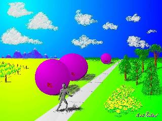

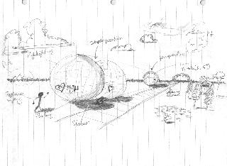
| The SketchOrdinarily, I don't precede the renderings with sketches. Almost everything I draw is on the computer. However, for complicated renderings, I will play with what the image is supposed to appear like when I finally get to the computer. |
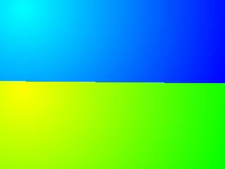
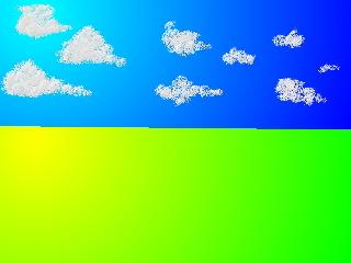
| Separating Earth and SkyThe basic approach to letting the pixels emerge is the let the pixels that are supposed to seem the furthest from the viewer emerge first. The far background is what everything else gets drawn on top of. |
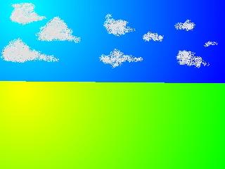
| Begin the CloudscapeThe pale blue sky is boring. Some modicum of clouds is necessary in order to make the sky interesting whatsoever or otherwise natural.
|
| 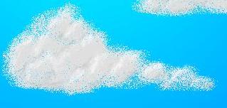 Finish the CloudsClouds are three dimensional. Just like any other three dimensional object in the sunlight, some cloud parts are brighter than others; some are darker. The highlighting and shading will make the clouds look "fluffier". |

| Beyond the HorizonI'm still working forward in the image. Next comes that sensitive region that would not be visible whatsoever except for its size. Things beyond the horizon are never as sharp as things closer, but they need to be identifiable in order for the distance effect to be useful.
|
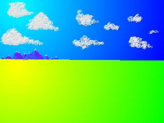
|  Snow in the MountainsI add snow to mountain peaks because it makes the objects more identifiable as mountains, and to make the mountains seem even larger, and thus more distant.
|

|  Blur the HorizonThe horizon is never straight. The horizon is never smooth. Blurring makes the horizon seem further away. |
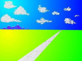
| Going the DistanceThe projection of three-dimensional parallel lines into a two-dimensional surface makes the parallel lines seem to intersect at a point. Railroad tracks would have worked; telephone lines, fences or walls would have had a similar effect. In this case, the parallel lines give the impression of the ground being very smooth and flat. |
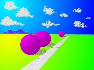
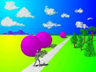
| Large ArtifactsMy ultimate objective with the rendering was to demonstrate the effect of size on perceived distance and the effect of the perception of depth by placing one object in front of another. I could have chosen anything; I choose spheres. The shadow on the ground attaches each sphere to the earth.I draw the sphere first in a separate file and paste smaller versions of it to the working image. 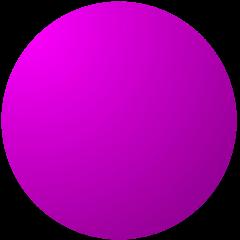
|
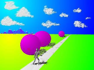
| A Human MeasureAdding a human-sized figure to an image is a very quick way of scaling the other objects that are visible. I draw the figure independently first and then paste it over the sidewalk and in front the spheres. The shadow ties the figure to the ground.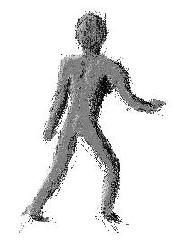
|

| Natural MonumentsThrowing in a few trees enhancing the identifiability and apparent familiarity of the rendering. The trees are drawn directly on the image. The trunks and leaves still have the highlighting/shadowing that makes the trees seem solid.
|

|  Finish the BackgroundIt's a violation of my rule about completing the furthest objects first, but I needed to be able to feel what happened with the middle ground trees before I started filling in the forest in the background. |
| Adding to the MidgroundShadows even help anchor trees to the ground.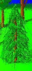
|

| Filling in Empty SpaceWhen I moved the human figure from the left hand side of the rendering to the middle, that left a large empty gap on the left. I had to put something in there. I thought about just a fence at first, but that still looked too empty. So, I added a garden instead.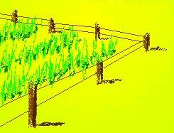
|
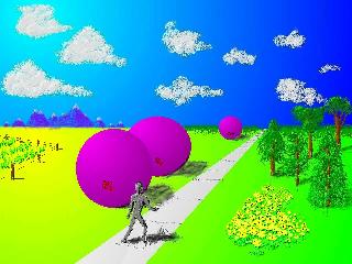
| Finishing the NeargroundThere's only a single flower in the flower patch in the lower right of the rendering. That flower is rendering in large form and then scaled down and applied at several locations in the patch of flowers.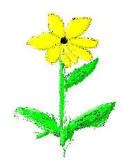
|

| SigningI keep my signature in a special file that I apply to my renderings when I've decided I don't want to ruin them with my tweaking any more. |